
Refine the Purchase Request Include Screen
Key Lesson: Refine a repeated Screen layout with a Card for each item, use the For Loop index in a dynamic title, and conditionally expose editing actions.
Refine the existing PurchaseRequestInclude Screen without changing its input variable, Cost Center control, item bindings, or Add Item action. This stage adds the presentation and editing behavior needed by the finished sample application.
Before continuing, confirm that the Screen contains the For Loop, the four item controls, and the Add Item button created in Purchase Request Include Screen.
1. Open the reusable Screen
Section titled “1. Open the reusable Screen”- In Design, under Object Types, select Screen.
- Open
PurchaseRequestInclude. - Select the Layout tab.
- Locate the For Loop that renders
screen.request.items.
Editor Help
2. Add a Card for each item
Section titled “2. Add a Card for each item”Use a Card to group the controls for each PurchaseRequestItem into a separate visual container.
- In the LAYOUT section of the Components toolbar section of the component toolbar, select Card.
- Drag the Card into the For Loop and place it at the top of the loop’s content area.
- Select the Card and configure its title:
| Property | Mode | Value | Notes |
|---|---|---|---|
| Title | Expression | | Select the T icon to switch the property to expression mode. The icon changes to E. |
-
Save your changes before continuing.
Each For Loop iteration now renders its own Card. The zero-based itemIndex is increased by one so the visible titles begin with Item 1.
3. Create the two-column item layout
Section titled “3. Create the two-column item layout”- Add a Layout inside the Card.
- Configure the Layout as follows:
| Property | Value | Purpose |
|---|---|---|
| Layout | grid with fixed columns | Arranges the item controls in a structured grid. |
| Number of columns | 2 | Places the four item controls in two columns. |
- Move the existing Description, Quantity, Budget Amount, and Currency controls into this Layout.
- Confirm that the Card and its Layout remain inside the For Loop.
-
Save your changes before continuing.
If an item control stops displaying or updating its value, confirm that it remains bound to the loop-scoped item variable. Do not bind a control to the full screen.request.items collection.
4. Add the Remove action
Section titled “4. Add the Remove action”Create a Card action area and replace its generated text with a button that removes the current item.
- Select the Card.
- In Properties, locate Action text.
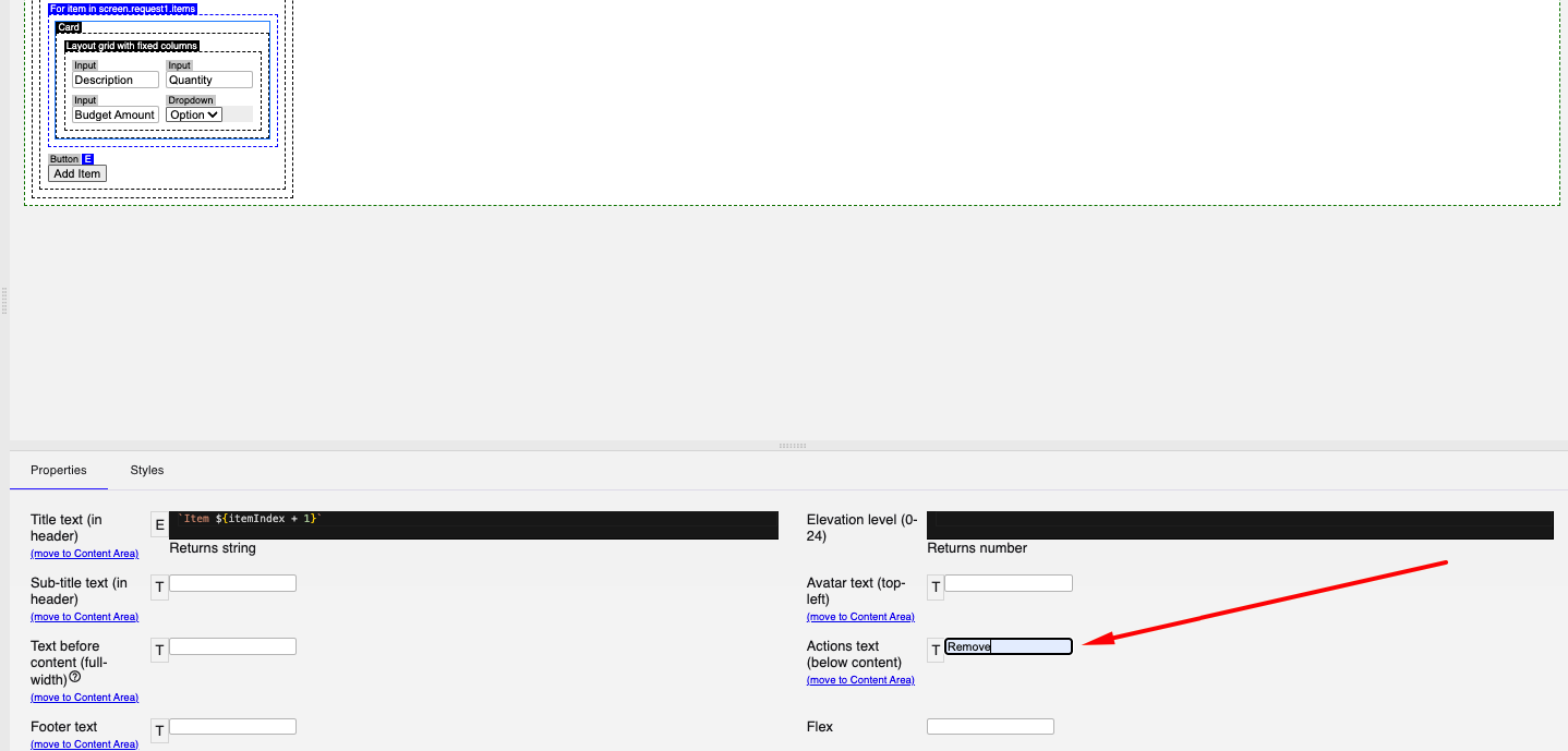
- Enter
Removein Action text. - Select Move to Content Area, then select OK.
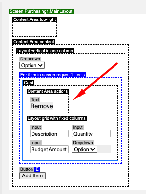
- Delete the generated Remove Text component.
- Add a Button in its place.
- Configure the button as follows:
| Tab | Property | Value |
|---|---|---|
| Properties | Prefix icon | delete |
| Properties | Text | Remove |
| Appearance | Color | Warn |
| Events → Click | Action type → Ad-hoc action | |
-
Save your changes before continuing.
The itemIndex supplied by the For Loop identifies the item removed from screen.request.items.
5. Hide editing actions in a disabled context
Section titled “5. Hide editing actions in a disabled context”Keep the Include Screen editable by default. When a parent Screen places it in a disabled context, hide the actions that change the item collection.
Complete these steps for both the Add Item and Remove buttons:
- In the LOGIC section of the Components toolbar section of the component toolbar, add an If component next to the button.
- Move the button inside the If component.
- Set the Condition property to:
| Property | Value |
|---|---|
| Condition | |
-
Save your changes before continuing.
$disabled is supplied by the surrounding Screen context. The !$disabled condition displays the editing action only when that context is not disabled.
Verify multiple items
Section titled “Verify multiple items”Test only the behavior introduced in Refine the Purchase Request Include Screen. Use distinct temporary values so that each item remains easy to identify.
1. Open the Purchase Request Screen
Section titled “1. Open the Purchase Request Screen”- Wait until the Purchasing application name is green.
- Open the application.
- In the application sidebar, expand Purchase Request.
- Select Create New.
The Create Purchase Request Screen opens and displays the Add Item action.
If the Screen does not open, return to Verify the first Screens and navigation and resolve the application build, navigation, or embedding issue before testing these refinements.
2. Verify multiple item Cards and titles
Section titled “2. Verify multiple item Cards and titles”- Select Add Item twice.
- Enter different values in the two item Cards.
- Compare the Card titles and controls.
Two independently editable Cards appear. Their titles are Item 1 and Item 2, and each Card presents Description, Quantity, Budget Amount, and Currency in a two-column layout.
- If adding another item changes the first item, confirm that every control is bound to the loop-scoped
itemvariable. - If a title does not evaluate, select the Card, switch Title to expression mode (E), and enter
`Item ${itemIndex + 1}`with the surrounding backticks. - If both Cards do not appear, confirm that Add Item runs
screen.request.items.push(new This.PurchaseRequestItem)and that the For Loop rendersscreen.request.items.
3. Verify item removal
Section titled “3. Verify item removal”- Select Remove on the first Card.
- Confirm that the Card containing the first item’s test values is removed.
- Confirm that the remaining Card still contains the second item’s values.
- Observe the remaining Card title.
Only the selected item is removed. The remaining item keeps its values and its dynamic title updates to Item 1 based on its current For Loop index.
Confirm that the Remove button is inside the Card generated by the For Loop and that its action is screen.request.items.splice(itemIndex, 1). If the wrong Card is removed, confirm that the action uses the loop-scoped itemIndex without a fixed number.
4. Verify disabled-state control configuration
Section titled “4. Verify disabled-state control configuration”The active application Screen is editable at this stage. Verify the configuration that later hides collection-editing controls when a parent Screen supplies a disabled context.
- Return to Lowgile Studio and open
PurchaseRequestInclude. - Select the If component that contains Add Item.
- Confirm that its Condition is
!$disabled. - Select the If component that contains Remove.
- Confirm that its Condition is
!$disabled.
Both editing buttons are nested in separate If components with the condition !$disabled. The controls are therefore available in the current editable Screen and hidden when a parent Screen supplies a disabled context.
If either action remains outside its If component or uses a different condition, return to Hide editing actions in a disabled context and correct the component placement or expression. Live parent-disabled behavior is tested later when the Include Screen is embedded in the Approve Request Screen.
5. Confirm the Screen extension is ready
Section titled “5. Confirm the Screen extension is ready”Use this checklist before setting up data storage, access, and shared application state.