
The Purchase Request Include Screen
Key Lesson: In this step, you learn how to create an Include screen that receives Purchase Request data from a parent screen and provides reusable controls for viewing and editing request details and items.
Create the PurchaseRequestInclude screen used to display and edit Purchase Request data from other screens in the Purchasing app.
1. Define the include screen object
Section titled “1. Define the include screen object”- In the Design area, under Object Types, select Screen. A list of default screens (Home, MainLayout, MainLayoutSidebar, MainLayoutHeader, UserProfile) appears.
- Click + to create a new screen.
- Enter PurchaseRequestInclude as the Screen ID, then click OK.
Insight
Include screens follow the naming convention as they are embedded in other screens:
- [ScreenName]Include
For example, PurchaseRequestInclude will be embedded in screens where users work with purchase request data, such as the Purchase Request Create Screen.
- The screen editor opens.
Editor Help
- Leave the text label Screen Purchasing.PurchaseRequestInclude in place for now. It keeps the main content area populated while you remove the default
MainLayoutwrapper. -
Save your changes before continuing.
1.1. Remove the MainLayout wrapper
Section titled “1.1. Remove the MainLayout wrapper”The Include screen will be embedded inside parent screens that already use MainLayout. Remove the Include screen’s default MainLayout wrapper to prevent a second application header and sidebar from appearing inside the parent screen.
- Locate the Screen Purchasing.MainLayout label in the layout editor.
- Click the label to select the
MainLayoutcomponent. - Confirm that only the
MainLayoutcomponent is highlighted and that none of its child components are highlighted. - Right-click the selected component and select Delete & keep children.
- Confirm that Screen Purchasing.MainLayout is no longer displayed.
- Confirm that the Content Area components together with their children remain in the layout editor.
- Save your changes before continuing.
Tip
If you accidentally delete the wrong components, you can recover the screen:
- If you have not saved the deletion, press F5 to reload the screen editor or close the editor without saving. Lowgile restores the last saved version of the screen.
- If you have already saved the deletion, add a Content Area component to the blank screen and continue rebuilding the screen content.
Refreshing or closing without saving discards all changes made since the last save, including any valid unsaved changes.
2. Define the screen variable
Section titled “2. Define the screen variable”The Include Screen needs access to a PurchaseRequest object passed in from the parent screen.
To enable this:
- Open the Variables tab (top-left of the screen editor).
- Click + Add new variable.
- Set the following properties:
| Property | Value | Notes |
|---|---|---|
| Name | request | Used in all bindings on this screen |
| Context | Input | The parent screen will pass the data into this include screen |
| Type | | Matches the entity you created earlier |
| Default expression | (Leave blank) | (Leave blank) |
-
Save your changes before continuing.
3. Display the screen variable in the VARIABLES sidebar
Section titled “3. Display the screen variable in the VARIABLES sidebar”Switch back to the Layout tab.
- Expand the request variable to see its variables (e.g., costCenter, createdOn, etc.).
Editor Help
If the request variable does not appear in the Variables panel (on the right-side of the Layout tab), press F5 to refresh the editor. You might need to refresh the editor more than once.
3.1. Add the cost center to the screen
Section titled “3.1. Add the cost center to the screen”- Drag request.costCenter onto the screen’s layout editor in the main content area (not the top-right content area).
Editor Help
When dragging a component or variable onto a screen, Lowgile displays a green placeholder indicating where the element can be dropped.
- Drop the variable onto the green area.
Attention
Make sure you drop this variable inside the screen’s main content area, not underneath the main content area.
- Lowgile automatically generates a dropdown for this lookup.
- Select the dropdown.
- Configure the dropdown’s properties as follows.
| Property | Value | Notes |
|---|---|---|
| Label | Cost Center | The dropdown's label describing its function |
| Binding | | Connects the UI control to the data model |
-
Leave all other properties at their default values.
-
Save your changes before continuing.
3.2. Remove the unused content area and text label
Section titled “3.2. Remove the unused content area and text label”Remove the unused top-right content area and the default text label before creating the screen’s outer layout.
- Confirm that the Cost Center dropdown is inside Content Area content.
- Select Content Area top-right and delete it.
- Confirm that Content Area content and the Cost Center dropdown remain in the layout editor.
- Delete the text label Screen Purchasing.PurchaseRequestInclude from Content Area content. We won’t be using it.
- Confirm that the Cost Center dropdown remains inside Content Area content.
-
Save your changes before continuing.
3.3. Create the outer vertical layout
Section titled “3.3. Create the outer vertical layout”Create a single outer layout for the include screen. This layout will contain the Cost Center layout, the purchase request items, and the Add Item layout.
-
Wrap the dropdown in a layout in either of the following ways:
-
Right-click method:
Select the Cost Center dropdown, right-click it, and choose Wrap with Layout. -
Drag-and-drop method:
Drag a layout component into the main content area, then drag the Cost Center dropdown into the layout.
-
-
In the layout’s Properties panel, set the following property so the Cost Center layout, purchase request items, and Add Item layout are stacked vertically:
| Property | Value |
|---|---|
| Layout | vertical in one column |
-
Leave all other properties at their default values.
-
Save your changes before continuing.
Editor Help
3.4. Wrap the Cost Center dropdown in a horizontal layout
Section titled “3.4. Wrap the Cost Center dropdown in a horizontal layout”Controls placed directly inside a vertical layout expand to the available width. Wrap the Cost Center dropdown in a horizontal layout so that the dropdown occupies only the width it needs.
- Select the Cost Center dropdown inside the outer vertical layout.
- Wrap the dropdown in another layout using either of the methods described in the previous section.
- In the new layout’s Properties panel, set the following property so the Cost Center dropdown retains its natural width inside the outer vertical layout:
| Property | Value |
|---|---|
| Layout | horizontal in one row |
-
Leave all other properties at their default values.
-
Confirm that the horizontal layout remains inside the outer vertical layout and contains only the Cost Center dropdown.
-
Save your changes before continuing.
4. Add purchase request item functionality
Section titled “4. Add purchase request item functionality”This section describes how to add purchase request item functionality to the PurchaseRequestInclude screen.
4.1. Add purchase request items
Section titled “4.1. Add purchase request items”The outer vertical layout now contains the horizontal layout for the Cost Center dropdown. Add the Purchase Request Items underneath that horizontal layout.
In the right-hand VARIABLES panel, under screen -> request, there should be an array or list of PurchaseRequestItems called items[].
Action
If the items[] variable does not appear:
- Press F5 to refresh the studio editor.
- If it still does not appear, verify that the one-to-many relationship between PurchaseRequest and PurchaseRequestItem is correctly defined in the data model, including the inverse relationship. See Define Entity Relationships for details.
- Drag the items[] variable into the outer vertical layout.
- Drop it on the green placeholder underneath the horizontal layout containing the Cost Center dropdown.
Attention
Do not drop items[] inside the Cost Center’s horizontal layout. The generated For loop must be a direct child of the outer vertical layout.
-
Lowgile will create:
- A For Loop block
- A Data Table
-
Delete the table. We are using the For loop in this example.
4.2. Configure the For loop
Section titled “4.2. Configure the For loop”With the For loop block selected, confirm the following properties:
| Property | Value |
|---|---|
| Array expression | |
| Loop variable | item |
| Loop variable type | |
Insight
When a screen variable represents a one-to-many relationship, Lowgile exposes it as an array that can be rendered in different ways. Reference Screen Concepts for a conceptual overview of how arrays are rendered in screens (including the difference between Data Tables and For Loops).
4.3. Add item variables inside the For loop
Section titled “4.3. Add item variables inside the For loop”The For loop repeats its layout once for every PurchaseRequestItem in the request.
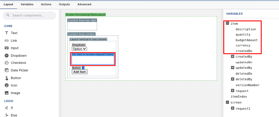
When the For loop is selected, Lowgile exposes a loop-scoped variable named item in the Variables panel. This variable represents the current item being rendered.
As seen in the following diagram, the item variable is only visible while the For Loop is selected. It appears at the top of the Variables panel, above the screen variable.
-
Select the For Loop inside the vertical layout.
-
In the VARIABLES panel, expand the item variable.
-
Drag the following variables from item into the for loop’s content area:
- description
- quantity
- budgetAmount
- currency
-
Use the following tables to configure each variable’s label, type, and binding.
Attention
Ensure that all bindings reference the loop variable (item) rather than the parent screen.request.items array. Bindings that point back to screen.request.items will cause build or runtime errors.
| Variable | Label | Type | Binding |
|---|---|---|---|
| description | Description | Text | |
| quantity | Quantity | Number | |
| budgetAmount | Budget Amount | Number | |
| currency | Currency | Binding | |
| Options list source | Static Entity | ||
| Options list StaticEntity | Purchasing.Currency |
-
Leave all other properties at their default values.
-
Save your changes before continuing.
4.4. Add item button
Section titled “4.4. Add item button”-
Add a button to the outer vertical layout underneath the For Loop. Make sure the button remains outside the loop.
-
Configure the button as follows:
| Button | Tab | Property | Value |
|---|---|---|---|
| Add Item | Properties | Prefix icon | add |
| Text | Add Item | ||
| Appearance | Prefix icon | Pick an icon here if you did not already select one in the Properties tab. | |
| Color | Primary | ||
| Events → Click | Action type → Ad-hoc action | |
- Wrap the button in a horizontal layout. Keep the horizontal layout directly inside the outer vertical layout, underneath the For Loop.
-
Save your changes before continuing.
This action adds a new, empty PurchaseRequestItem to screen.request.items. Because the list is rendered by a For Loop, the new item appears immediately on the screen.
5. Refine the layout and add remaining actions
Section titled “5. Refine the layout and add remaining actions”5.1. Add a Card for each purchase request item
Section titled “5.1. Add a Card for each purchase request item”Use a Card to group the fields for each PurchaseRequestItem into a separate visual container.
- In the LAYOUT section of the Components toolbar section of the component toolbar, select the Card component.
- Drag the Card into the For loop, placing it at the top of the loop’s content area.
-
Save your changes before continuing.
Each iteration of the For Loop now renders its own Card.
Configure the Card title
Section titled “Configure the Card title”Give each Card a dynamic title so users can distinguish between multiple purchase request items.
- Select the Card.
- Configure the title as follows:
| Property | Mode | Value | Notes |
|---|---|---|---|
| Title | Expression | | Click the T icon to switch the property to expression mode. The icon changes to E. |
-
Save your changes before continuing.
5.2. Add a layout inside the card
Section titled “5.2. Add a layout inside the card”- Before dragging the 4 item variables inside the card, add another layout inside the card.
- In the layout’s Properties panel, set the following property:
| Property | Value | Notes |
|---|---|---|
| Layout | grid with fixed columns | Arranges item fields into a structured grid so each purchase request item is compact, readable, and visually consistent |
| Number of columns | 2 | Leave as the default for now |
- Drag the 4 item variables inside this layout.
-
Save your changes before continuing.
5.3. Add a Remove Action to the Card
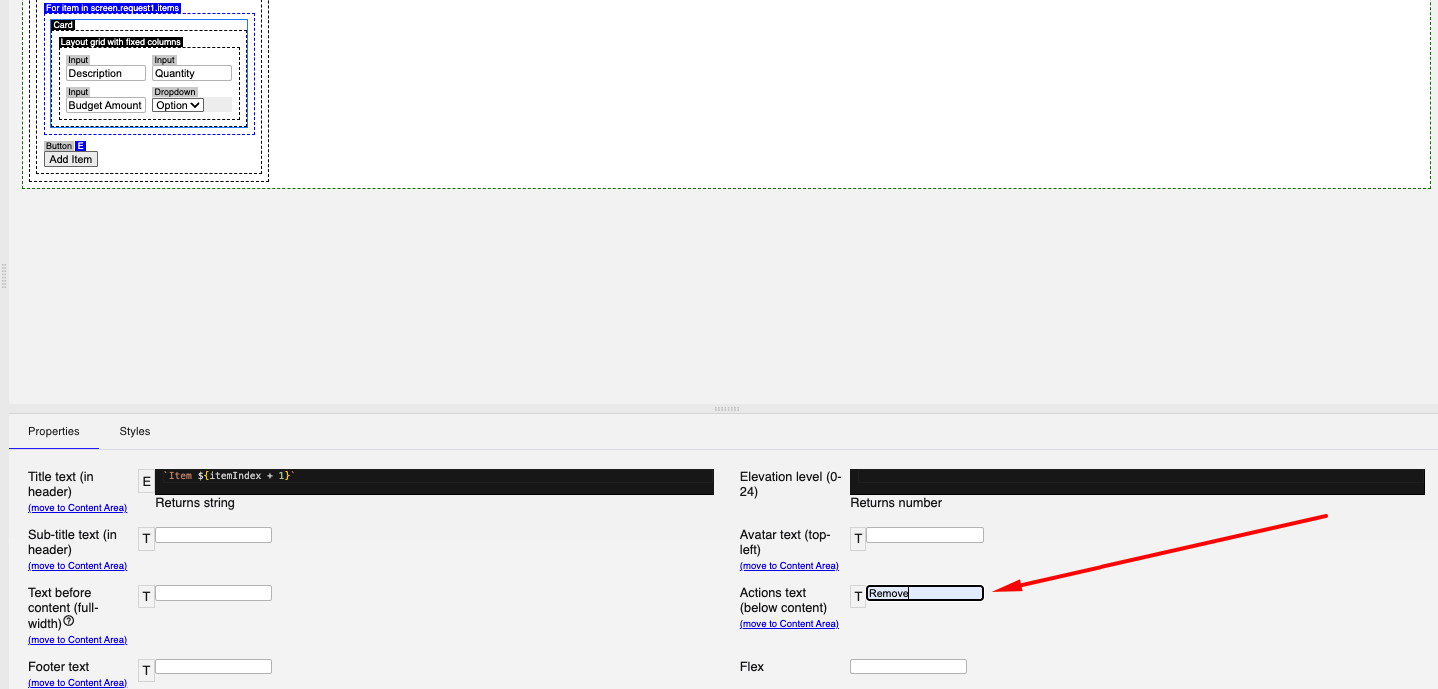
Section titled “5.3. Add a Remove Action to the Card”Add a Remove Action (button so users can delete purchase request items they no longer need.
- Select the Card.
- In the Properties panel, locate Action text.
-
Enter Remove in the Action text property.
-
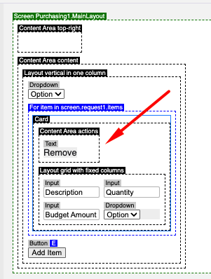
Click Move to Content Area, then click OK.
A new content area is added to the Card.
-
Delete the generated Remove Text component.
-
Add a button in its place.
-
Configure the button as follows:
| Button | Tab | Property | Value |
|---|---|---|---|
| Remove | Properties | Prefix icon | delete |
| Text | Remove | ||
| Appearance | Color | Warn | |
| Events → Click | Action type → Ad-hoc action | |
-
Save your changes before continuing.
5.4. Hide the Add Item and Remove buttons when the screen is disabled
Section titled “5.4. Hide the Add Item and Remove buttons when the screen is disabled”Hide the Add Item and Remove buttons when the include screen is used in read-only mode.
For both the Add Item and Remove buttons:
- In the LOGIC section of the Components toolbar section of the component toolbar, add an If component next to each button.
- Drag the button inside the If component.
- Configure the If component as follows:
| Property | Value |
|---|---|
| Condition | |
-
Save your changes before continuing.